Abstract Level Design and How to Utilize it
Article by: Hanabarger
Level design can be hard. Building a level that is fun, challenging, flows well, and fits into the context of your world can be a daunting task, especially if level design isn't really your field. This week, I hope to ease your struggles by providing a method that will help you focus your design process and make you a better designer. It's called 'abstract level design', and it stems from the days of early PC first-person arena shooters like Doom, Quake, Unreal Tournament, and Heretic.
What is Abstract Level Design?
Simply put, abstract level design is a way of designing levels that puts play and functionality first, stripping away elements that tend to cloud judgment during the design process. Don't worry, we aren't making modern art here;
you will get to add flavor and flair. You will just be doing it later than some might. This method builds from simple geometry: lines, rectangles, circles, horseshoes, and other n-gons. John Romero was perhaps the pioneer of this
type of 3D level design, and it shows in id Software's flagship work, Doom.

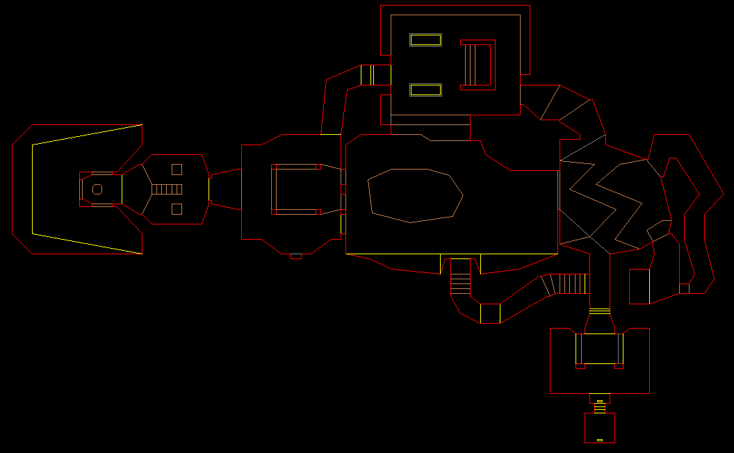
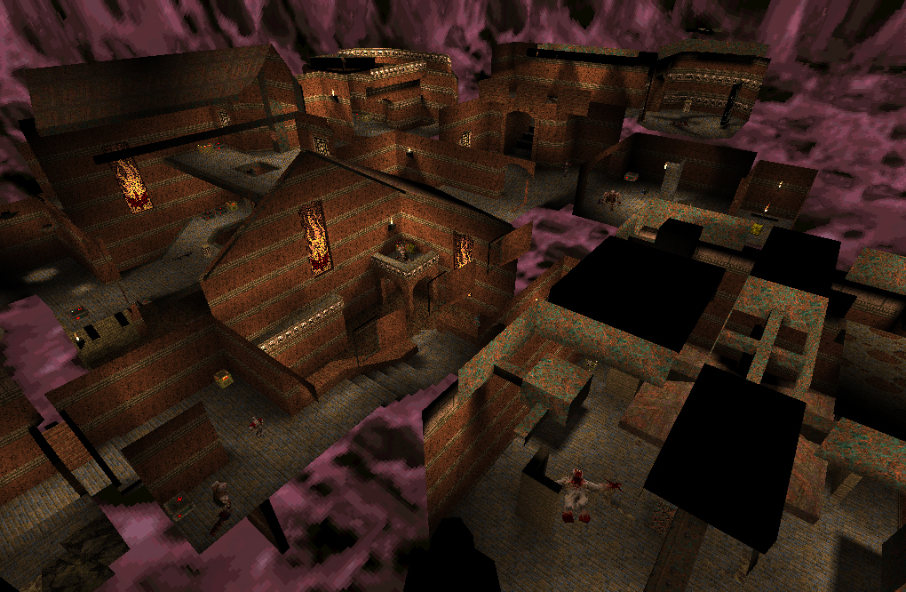
Doom's first mission, entitled 'Hangar', hardly resembles its title. It is, however, incredibly function-oriented. That's not to say Hangar didn't look good for the time, but it is clear that Romero wasn't focused on actually building a hangar. Hangar, along with many other missions in Doom, are among some of the most memorable first-person shooter stages in the genre's history. This is due not only to the game which they are in, but simply because of their focus on putting the 'fun' in function.
The Process
The process of abstract level design is rather simple, but it will take some practice to get used to it. You'll want to get some graph paper and colored pencils to sketch with, though if you prefer a digital program, that will
work just as well.
Since you can't develop from absolutely nothing, you'll need an idea to start with. It can be a location, a feeling or emotion, or a reference image. Chances are you'll already have a goal in mind for whatever level you'll make, so this step should be done already. With this idea in mind, begin placing down shapes, keeping in mind enemy placement and flow. If you plan on having a large crossroads or hub, I'd recommend starting from there and designing your entryway and exit last. This will let you take whatever you create in your branches and amalgamate it all in the entryway, so as to give the player a sampling of the things they can expect to find in the level. Personally, I break my levels down into a series of formal challenges. Each of these challenges has an entry, a set of enemies or platforming challenges, some sort of reward, and an exit. Remember, the goal is to create something that would be fun even without the feeling evoked by the environment. Once you're done, you'll have a blueprint for the level. Try implementing it in your game if you can.

Does this sound strange and vague? Well, that's because it is. Make no mistake, this isn't an entry-level concept, and it's one that requires prior level design experience and understanding to be pulled off effectively. It is function born from feeling and instinct. By playtesting in blank or color-coded environments, you'll instantly understand when something feels off, wrong, or just bad. Once you're satisfied with how the level plays, you can start adding textures and details. Just make sure those additions don’t break parts of your level. You'll want to playtest and iterate continuously; I usually do so after finishing a challenge. Remember this simple development loop: create, integrate, playtest, iterate.
Multiplayer Application
This method works for developing multiplayer maps as well. It is, perhaps, even better here than for single-player environments. You can use the method I talked about above, or you can try this other way of using abstract level
design: the flowchart method.
The flowchart method is a bit more nebulous than the earlier geometric method, but it can help to ensure your multiplayer levels aren't all functioning in a similar way. The flowchart method works like, well, a flowchart. A series of arrows and circles (which I call conduits and conflict points) constitute an early blueprint for your level that doesn't necessarily need a specific idea or location in mind.
Conflict Points are areas of interest that players will be drawn to. This can be advantageous terrain, a strong weapon or power-up, an objective, or a landmark. The Conduits are how players go between Conflict Points. It's a very simplistic way of designing levels that works well for early stages of development or exercises.
You can create a lot of interesting flowcharts by layering simple shapes on top of each other. For instance, if you take a circular chart and lay it over a couple of rectangles, there are a ton of potential combinations. Here are a few things to keep in mind while using this method that expand to general level design tips. First, try to avoid symmetry when possible. Symmetrical areas are generally very boring and tend to make the player disoriented (particularly if the structure is a circle or torus.) Second, use landmarks to help the player learn the level faster. They can be anything from interesting looking trees, flashy billboards, or interesting man-made structures. Lastly, try to avoid dead-ends. When possible, you don't want the player doing any unnecessary backtracking. This extends doubly to multiplayer levels, where being stuck in a dead-end could mean being trapped. Campers can also use dead-ends with great efficacy if they lead straight out into an open area.
High-Level Simplicity
This has been an invaluable tool to me in recent months, so I hope this design philosophy can help you become a better designer. It takes practice, and requires some previous knowledge of level design, but I think this can be a very
effective means of overcoming "developer's block".
